The Pepper Challenge
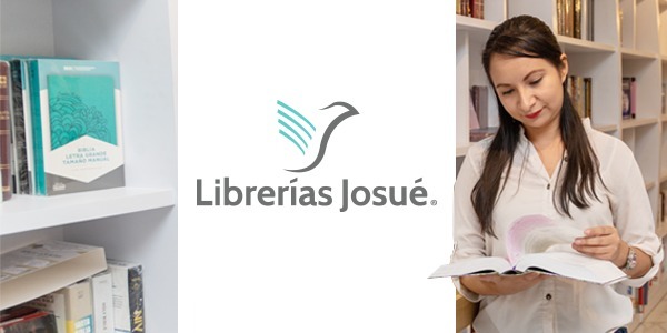
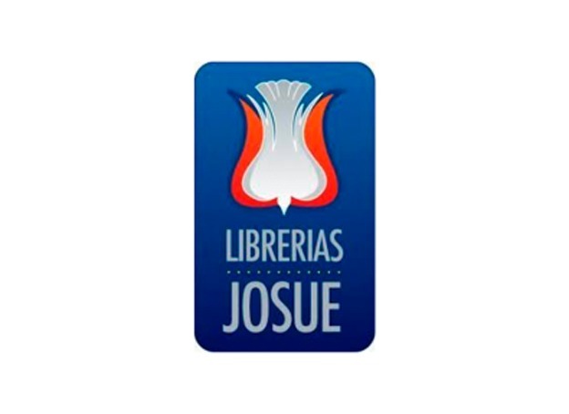
Whit years of trajectory in the market, Librerías Josué with the porpuse of removing the cliché of bein a book stores that only sales christians-evanelicals books, decided to do a subtle change of imagen. The challenge was to transform to Librerías Josué in a more modern concept and project it as a different place, warm, positive and cheerful.
 .
. 
The Pepper Solution
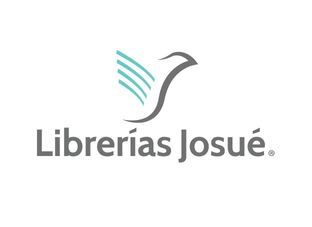
During a marketing analyze the Branding expert team created a new personality for the brand focused on the peace and purity of the love of god. With this symbol of the dove in a White background and light blue tone and aqua next to a friendly typography it sought to express peace and tranquility.
Before, Librerías Josué was mostly positioned with the name of Josue and nowadays they have the same analysis in two words “Librería and Josue“ to emphasizethe item and balance the religious level.
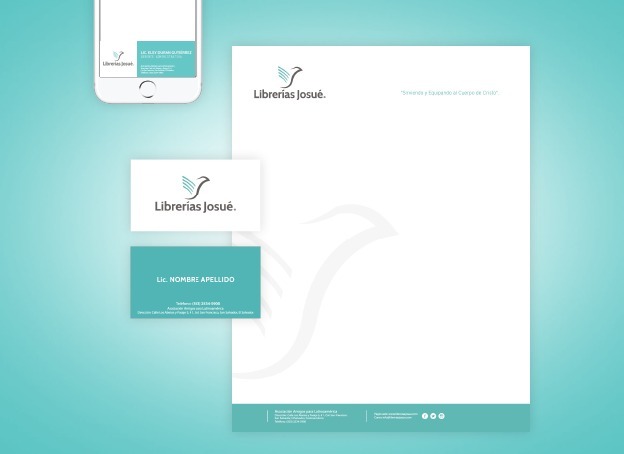
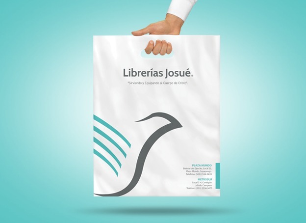
The logotype is a simplification of the profile of a dove and an open book.The book is a clear reference to the products. The book pages are distinginguish with aqua color, that represents the oasis water in middle of the desert and being a modern color, projects to Librerías Josué as a modern place, positivein wich you can find answers for different problems. Leave the prejudices of to be a bored place or religious place.
 .
. 
Client Phrase
“With the change people feel identified although have known a logo with more than 40 years, the new image have had a great acceptation and to our client have liked. The change was one of the elements that have contributed to get better the sales in more than 20%, the clients congratulation us forthe new logo”.
Licda. Dinora, Metrocentro Store Manager
Customer: Teri Benner
Brand: LIBRERÍAS JOSUÉ
Branding Project:
- Brand Analytics
- BrandBook
- Institucional Graphic Line
- Publicity Graphic Line
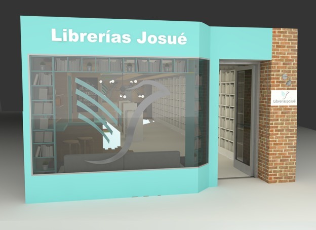
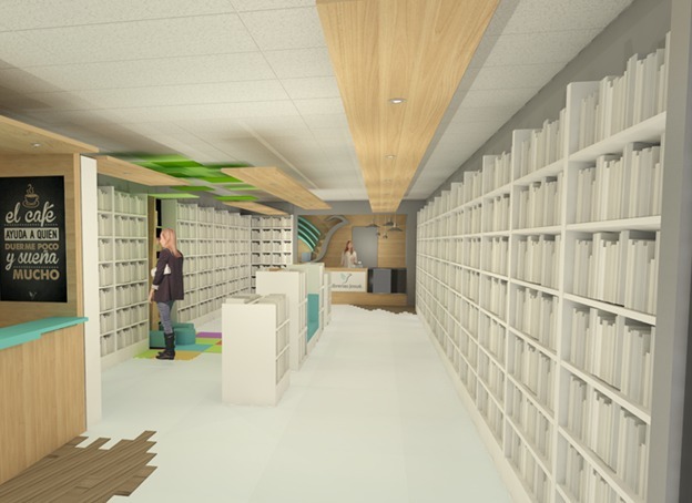
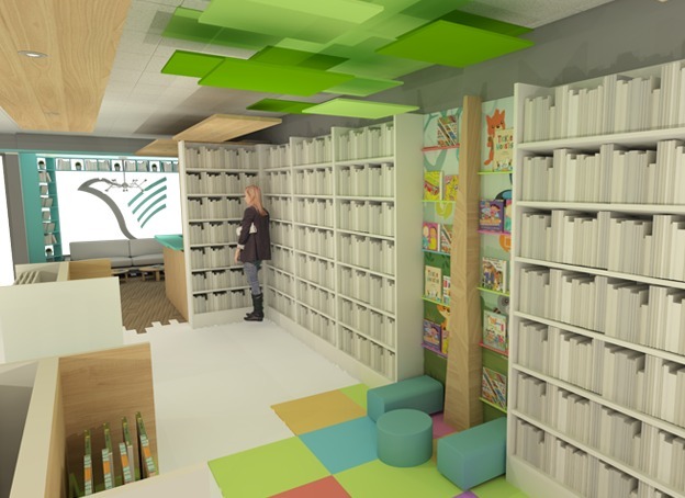
- Interior Design
- Institutional Graphic Material