Grupo UNICEN
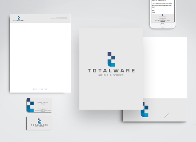
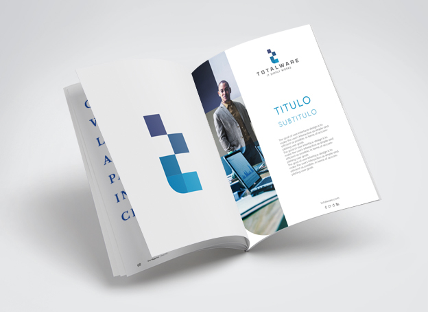
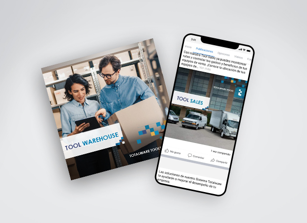
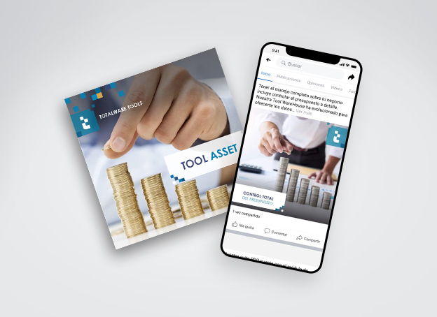
Generate a Rebranding for Totalware with a modern, technological, fresh and cutting-edge form for the re-launch of the system. The Pepper team created a new logo, the new graphic line, the look of the website, the new image of the platform. The design of it, was rescued from the previous concept of armable parts, but this time, it was conceptualized in tetris style, known by having pieces falling and assembled at the end.

The Pepper Solution
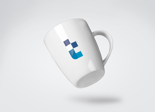
The "T" of Totalware was designed to look very technological and evokes something similar to an application, for an APP where the different shades of technological colors are seen and are being assemble, the T as a tetris is armed. The typography is clear and clean, minimalist and seeks to give prominence to the T, what can be position in everything: social networks, stationery arts, imagotype, application of the program, the software and in the system.
A simple and functional slogan was added: "It Simply Works" in order to understand that Totalware has those characteristics and that it just works well. It has a modern and avant-garde graphic line to position itself as a competent software brand at the level of an SAP, but made in El Salvador for the entire Central American region and why not, Latin America.
The difference between Totalware and other systems is that it incorporates the laws of El Salvador; that is to say that it gathers all the necessary legislation to carry out the accounting in a company, for what it is considered; the only system that really works by integrating everything necessary for accounting management and management controls, this being a great advantage.

Client Phrase
"Thanks to the change of image, we are now trading new clients that are regional companies and our image is much more competitive, and we perceive ourselves as SAP, as a large company"
Guillermo Pérez. Totalware Sales Manager
Client: Ximplex
Brand: Totalware
Branding Project:
• Branding Assessment
• BrandBook
• Web Design
• Platform Design
• Digital Strategy
The interesting thing when it comes a Rebranding is that it can be done without a lot of investment. We can achive this, only by implementing specific changes that make possible to differentiation of a brand from its competitors and, at the same time, capturing the eyes of potential customers.
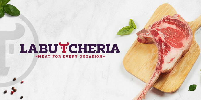
La Butcheria is the first butchery shop in El Salvador where you can find all types of Premium Beef cuts and CAB (Certified Angus Beef) perfect for every occasion, from daily meals to weekend barbecues with friends. We designed a modern logo using a solid and visible typography and an icon representing a beef´s head, which tells us about the meat´s origin. It communicates quality, experience and has an International look, since the shop sells imported cuts.
