Branding
The El Salvador Stock Exchange sought to be a partner of Pepper in its rebranding project as it needed to project a more modern image, looking to the future and closer to all investors, regardless of the size of the investment.

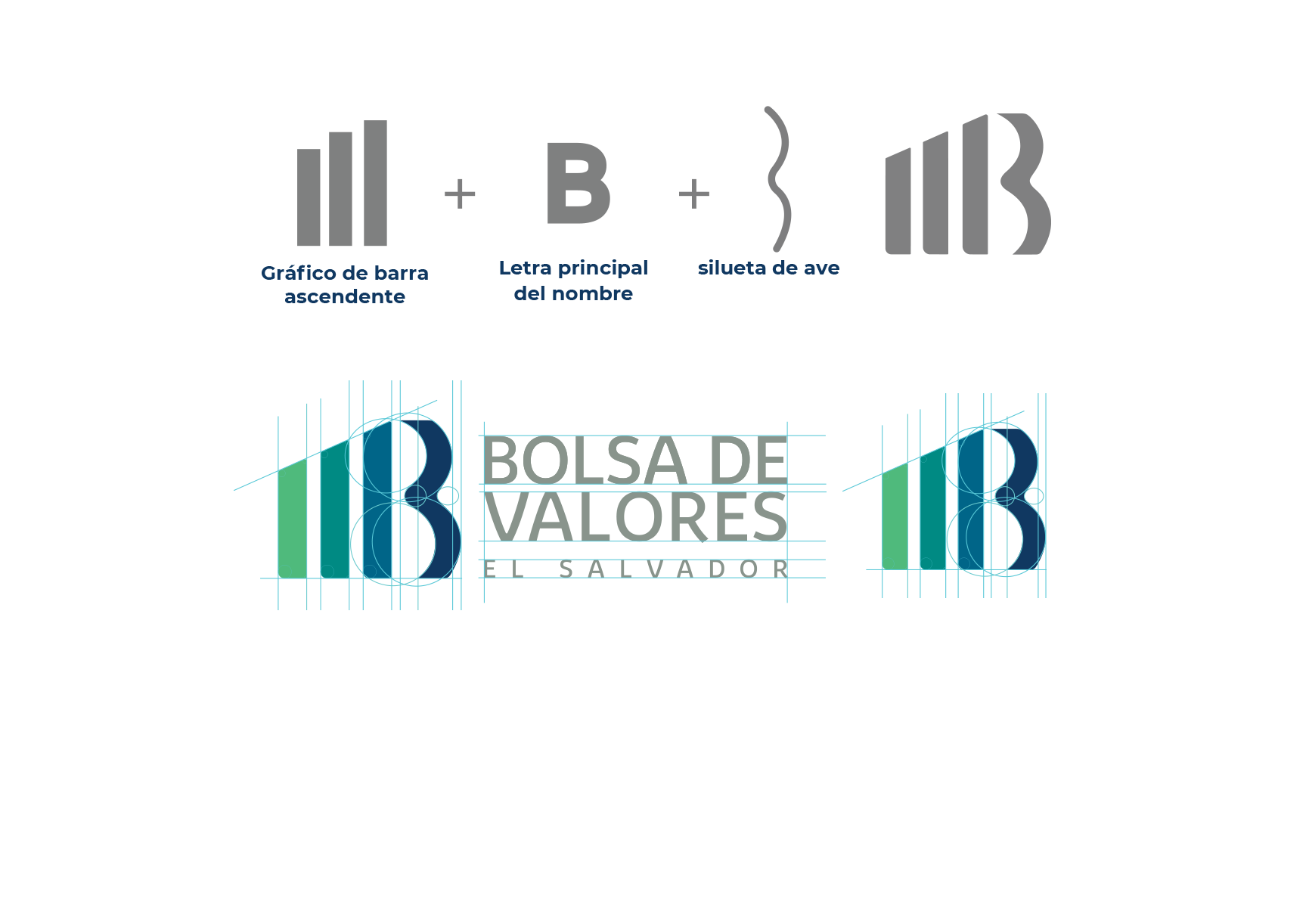
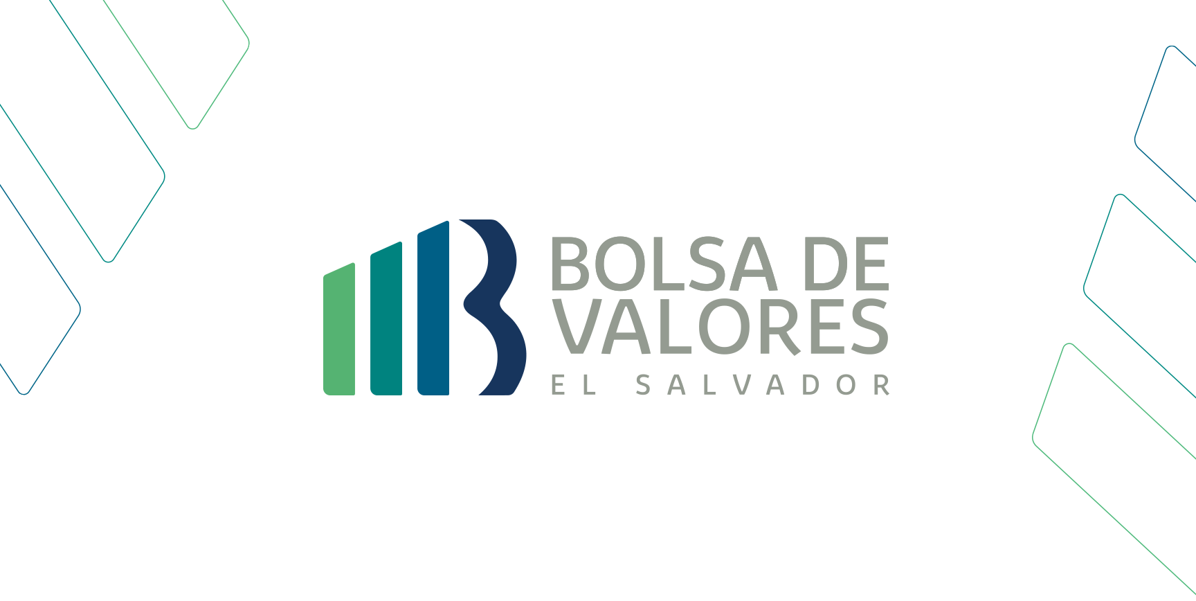
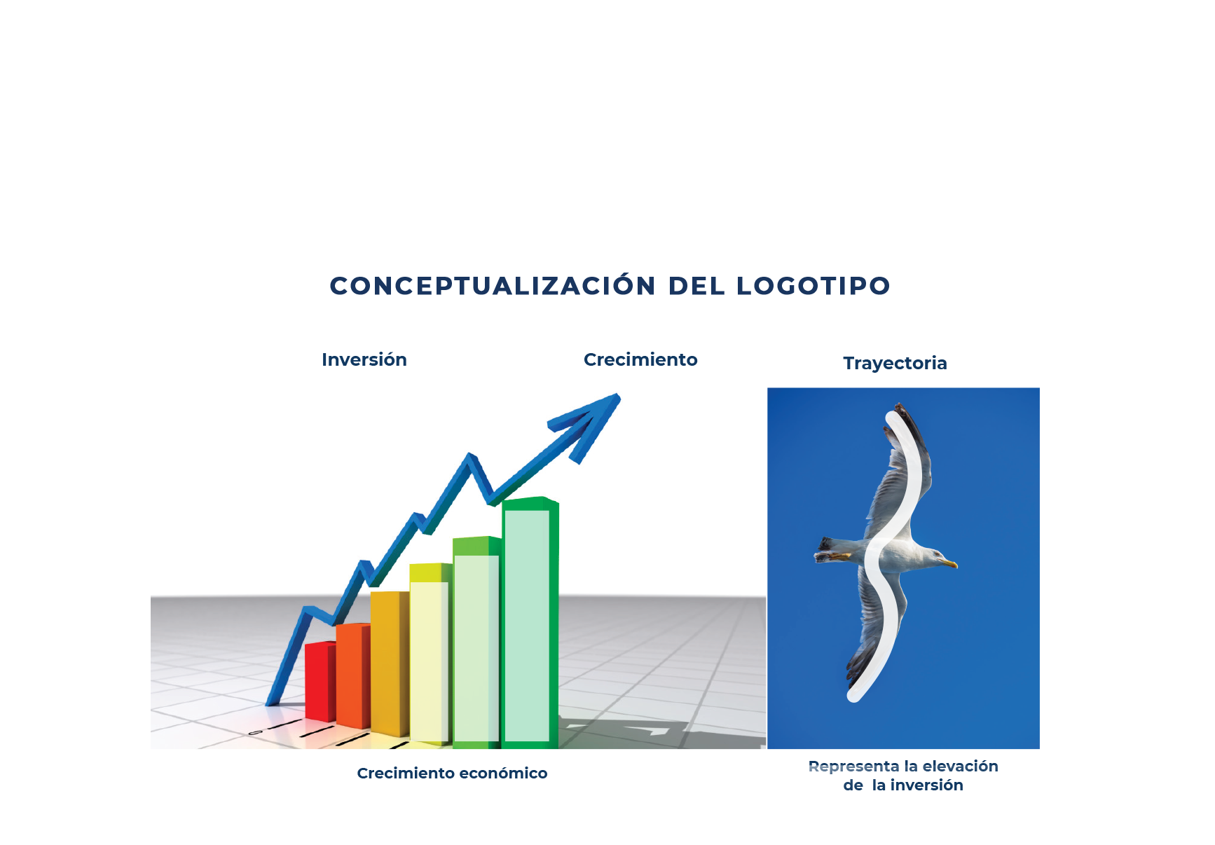
Thus, a fresh, current logo was designed, with a concept that starts from the growth of all economic sectors (represented by the bar graph) to the achievement of goals and objectives (represented by the figure of a bird). The bird icon was used to convey how the Stock Market helps people to reach the top and take off economically.
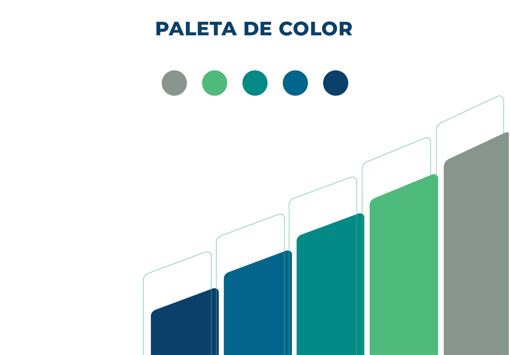
The color palette is modern, corporate, but at the same time fresh and close. The lighter green and blue add warmth. The resource of placing the colors from lighter to darker gives it dynamism, and symbolizes how we went from growth to solidity.


Within the pieces designed for the new image, institutional stationery was worked on, looking for a modern and professional line
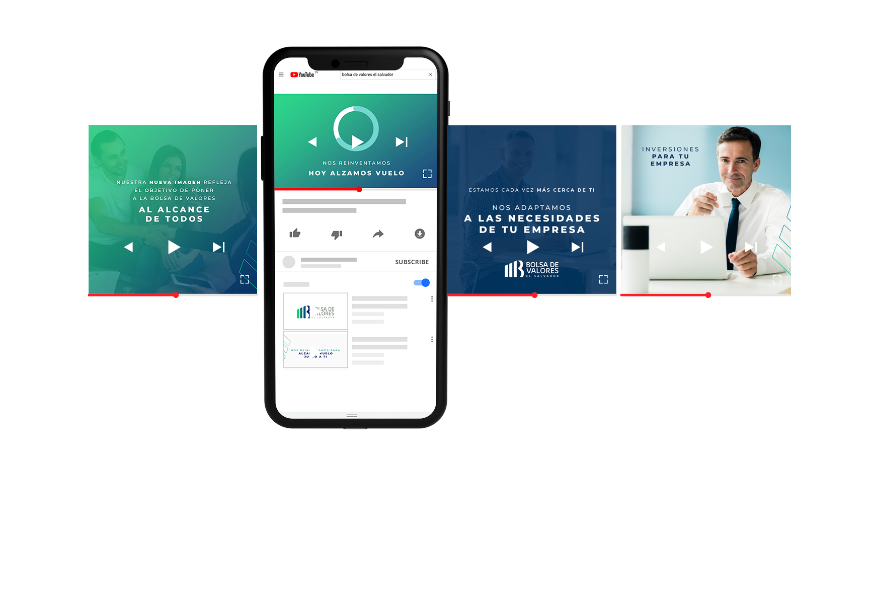
A digital campaign was worked on in which the new image was unveiled on social networks. Messages were created that highlight the strategic objectives of the Stock Exchange, with phrases that connect with the different buyer personas.


A versatile graphic line was created that could be compatible with all digital adaptations. One of the main objectives of the rebranding was for the brand to move dynamically in the digital environment.


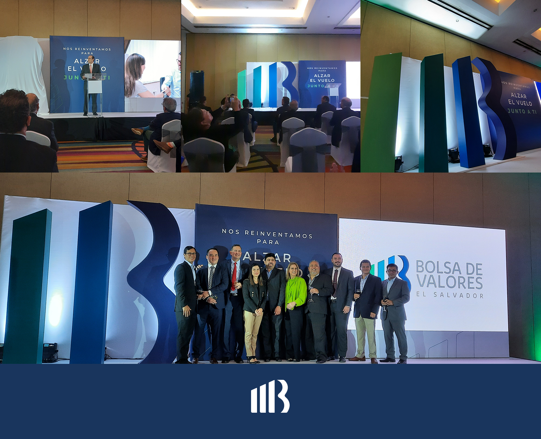
The website design was created, as well as the new image of facebook, instagram and linkedin. In turn, Pepper coordinated and adapted the image to its launch event, which was attended by the media and important people from the stock market.

