Pepper Challenge
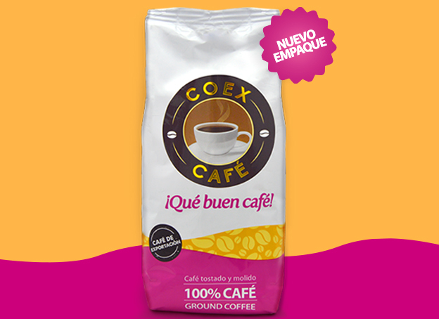
Redesigning the packaging of Coex Café was the main mission. We wanted to make a new packaging design that was more current to attract new market niches, mainly to young people.
The new design should be modern, however, it was important to always maintain the characteristic aspects of the brand. All this to achieve that Coex will return to the top of mind of the Salvadoran market.


The Pepper Solution
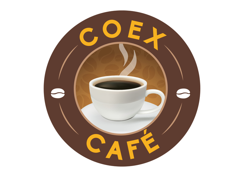
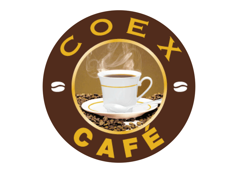
The process began with the redesign of the brand's logo, a change was made keeping the essence of the logo, because they wanted to preserve the tradition characteristic of the brand. To achieve this, elements such as typography and certain visual components such as the cup were worked on.
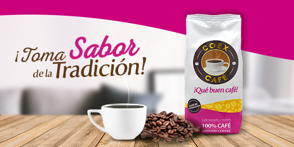
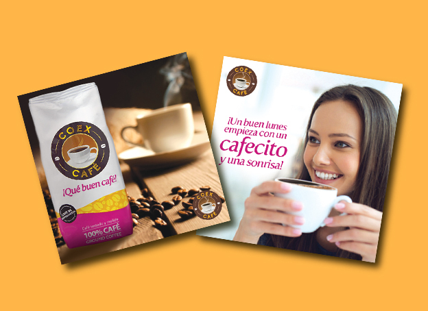
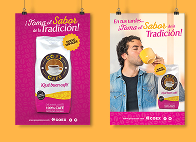
Subsequently, for the freshening of the packaging, more vivid and fresh colors were used to attract the eye of the young. It was a combination of striking colors, contrasting the fuchsia with a yellow to generate visual impact, hand in hand with whites and coffees, representative of the traditionalism of the brand.
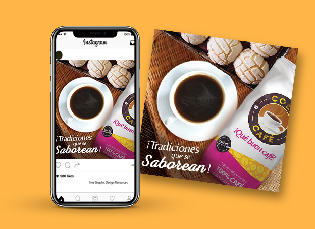
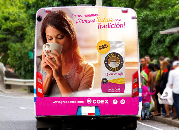
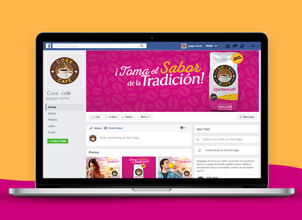
Finally, all this was carried out in a campaign in digital and traditional media. A campaign was carried out in social networks where the main message was "Take the flavor of tradition", same message was also implemented in traditional media, such as mupis, back buses and mass points of sale.


Client Phrase
"With the new image and the digital campaign created by Pepper Design & Branding, we succeeded in re-launching the brand and retaking the top positions in Top of Mind of the coffee industry"
Flor Huezo, Marketing Manager
Client: Coex Group
Brand: Coex Café
Branding Project:
- Branding
- Packaging
- Digital Strategy
- Advertising Campaign and Digital

