The Pepper Challenge
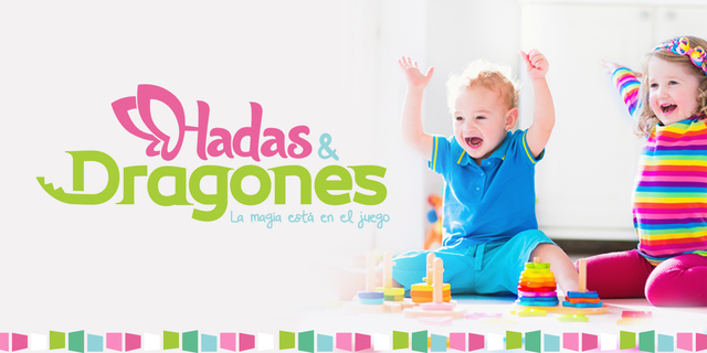
In spite of the time that the store had, very few people found out about the magic that this toy boutique had. To increase their customers, Fairies and Dragons decided to improve their branding with Pepper advice. At the beginning the design of his logo was quite saturated: cartoons, several colors, basic typography, descriptive words, all that in a one small space.


The Pepper Solution
The redesign purpose was to simplify its image. To achive this, the name of the store was conceptualized and the distinctive elements, of Fairies and the Dragons, were adapted(the wings and the tails).
These two elements make reference to fantasy, dreams and adventures that children live with their imagination. The imagination of girls associated with fairies and boys with dragons. Both, have in common their participation in the fantasy world.


These distinctive elements were applied directly to a new name typeface, thus creating an illustrative logo, with a playful and cleaner character.
The slogan was also created, "The magic is in the game". Itcovers the whole concept of the toy boutique and emphazise in the product, which are the toys and who will make use of them to continue creating magical worlds.
Get in touch with us at:


