Branding in an online store

Mi Carretilla is an online shopping site with reach throughout Central America. It was born with the idea of selling all kinds of items online at regional level.
The Pepper Challenge
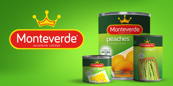
Monteverde trust in the projects of Branding and Packaging that Pepper Design & Branding makes; they opted for a makeover to increase sales and be more competitive in all your distribution channels.
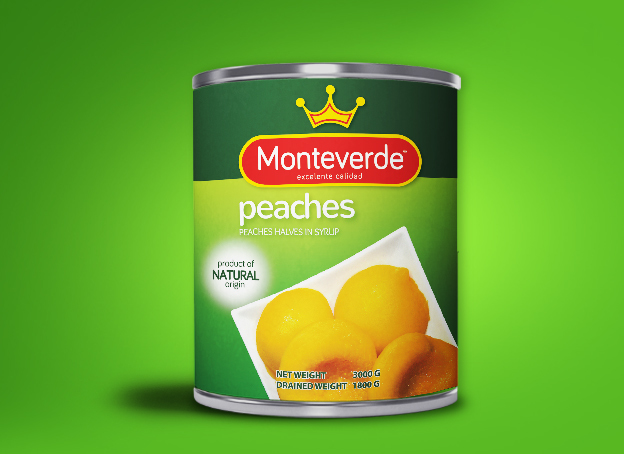
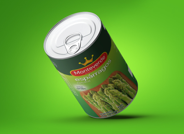
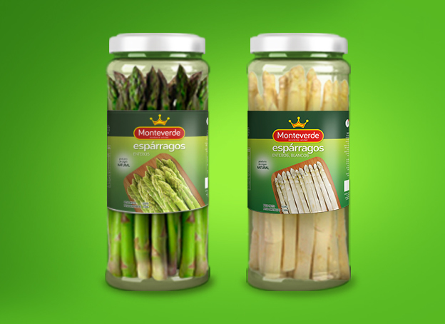
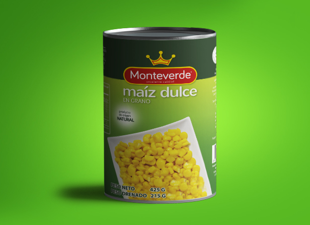
The entire line of new packaging and a cooler and clearer advertising graphic line was created, accompanied by an update of the logo, without losing its essence.
The Pepper Solution
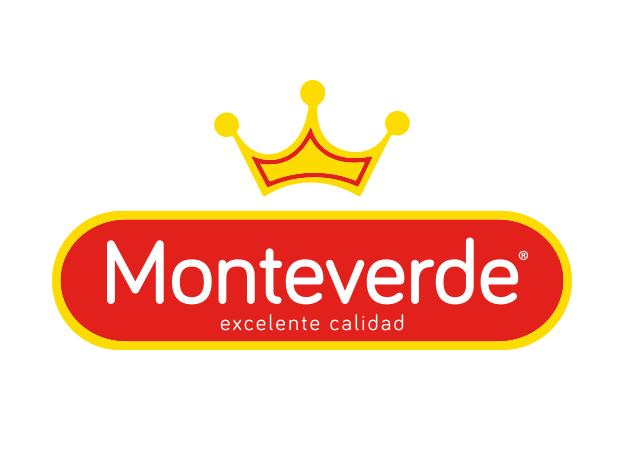
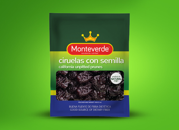
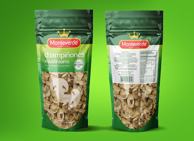
Through a brand personality analysis, the image change was made, using more visually appealing photographs, highlighting their attributes and positioning their color.
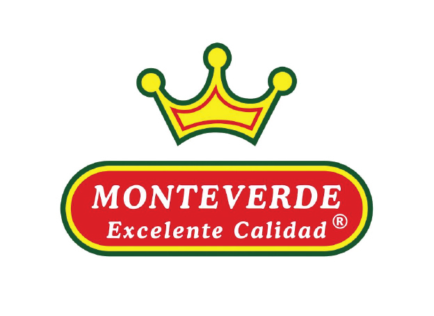
Some elements were used such as the crown, the oval and the Monteverde word with its slogan "excellent quality" to maintain the essence of the brand. The typography that was used is modern, clear and legible, the logo was cleaned by removing some elements, highlighting the crown and increasing the letter to emphasize the name and position it in the mind of the consumer.
The logo seen from the packaging impacts, thanks to the more complete concept design where you can see the combination of shades of green that stand out in addition to the logo, photography; This achieved a visual impact on the gondola and differentiation from its competitors.
Client Phrase
“Thanks to the refreshing that Pepper Design & Branding did, our brand has positioned itself better, the logo is more striking, the color more lively and attractive. Our product stands out and impacts more, so our sales have remained with a good margin ”
María Elena Villacorta. Monteverde Brand Manager
Client: Monteverde
Brand: MONTEVERDE
Brand Project:

Mi Carretilla is an online shopping site with reach throughout Central America. It was born with the idea of selling all kinds of items online at regional level.
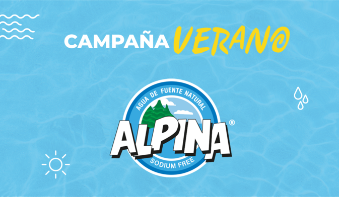
As a Marketing strategy for this campaign, this concept was created in which it is emphasized that, although summer is fun and we share entertaining moments, we cannot ignore hydration, especially when we go on vacation in hot environments and we are going to be doing more physical activities.

Manderly
