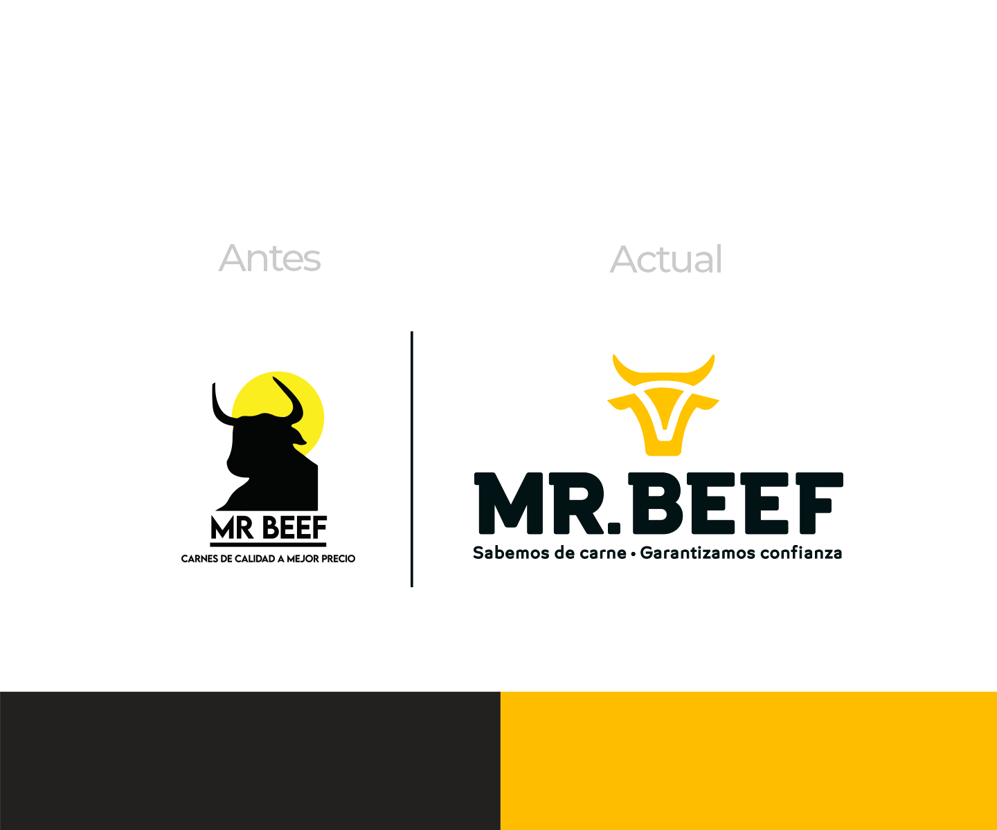
Mr. Beef is a wholesale supplier of quality imported meat products, whose main characteristics are: trust, experience, service, compliance and guarantee. The brand saw the need to refresh its image in order to focus on new markets and transmit the solidity and expertise that its trajectory gives it. They started with a logo refresh.
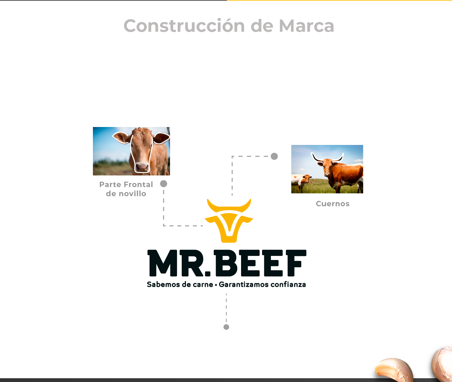
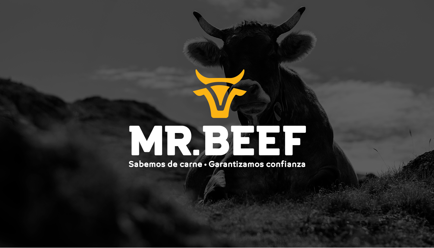
The logotype was inspired by the strength of the steer and the solidity that it transmits, complementing it with a typography of a firm character, which generates confidence.
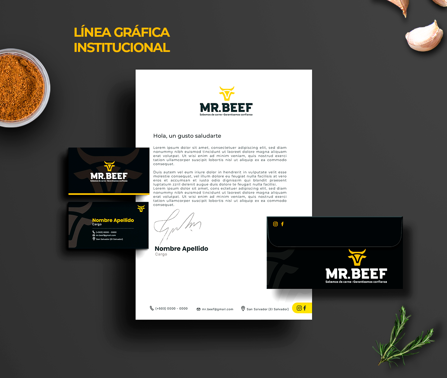

A modern and professional graphic line was developed, and a communication campaign with messages that manage to connect with business owners, butcher shop owners, sales managers, restaurant and hotel purchasing departments. The objective is to convey that working with Mr. Beef as a supplier is working hand in hand with an expert.
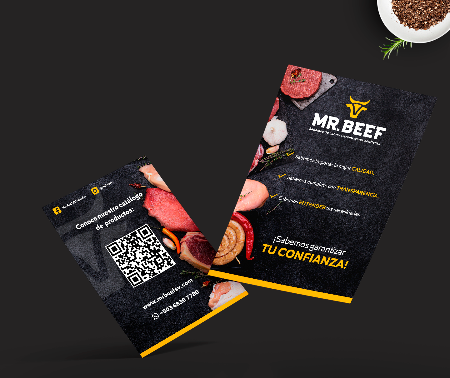
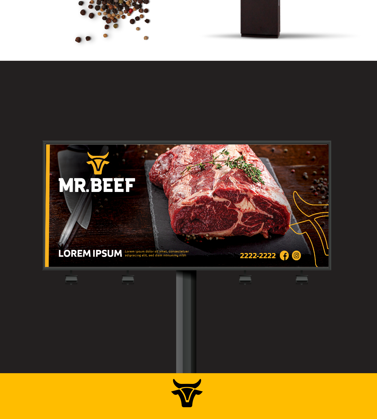
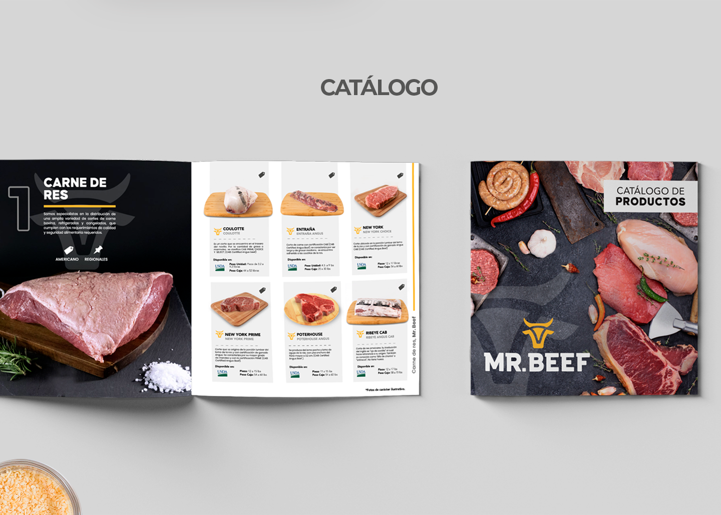
The graphic line was adapted to materials such as website flyers and product catalogues. The designs feel professional and convey the strength of the company. The black color generates a great contrast with the product, helping to highlight it and the yellow adds warmth and dynamism.
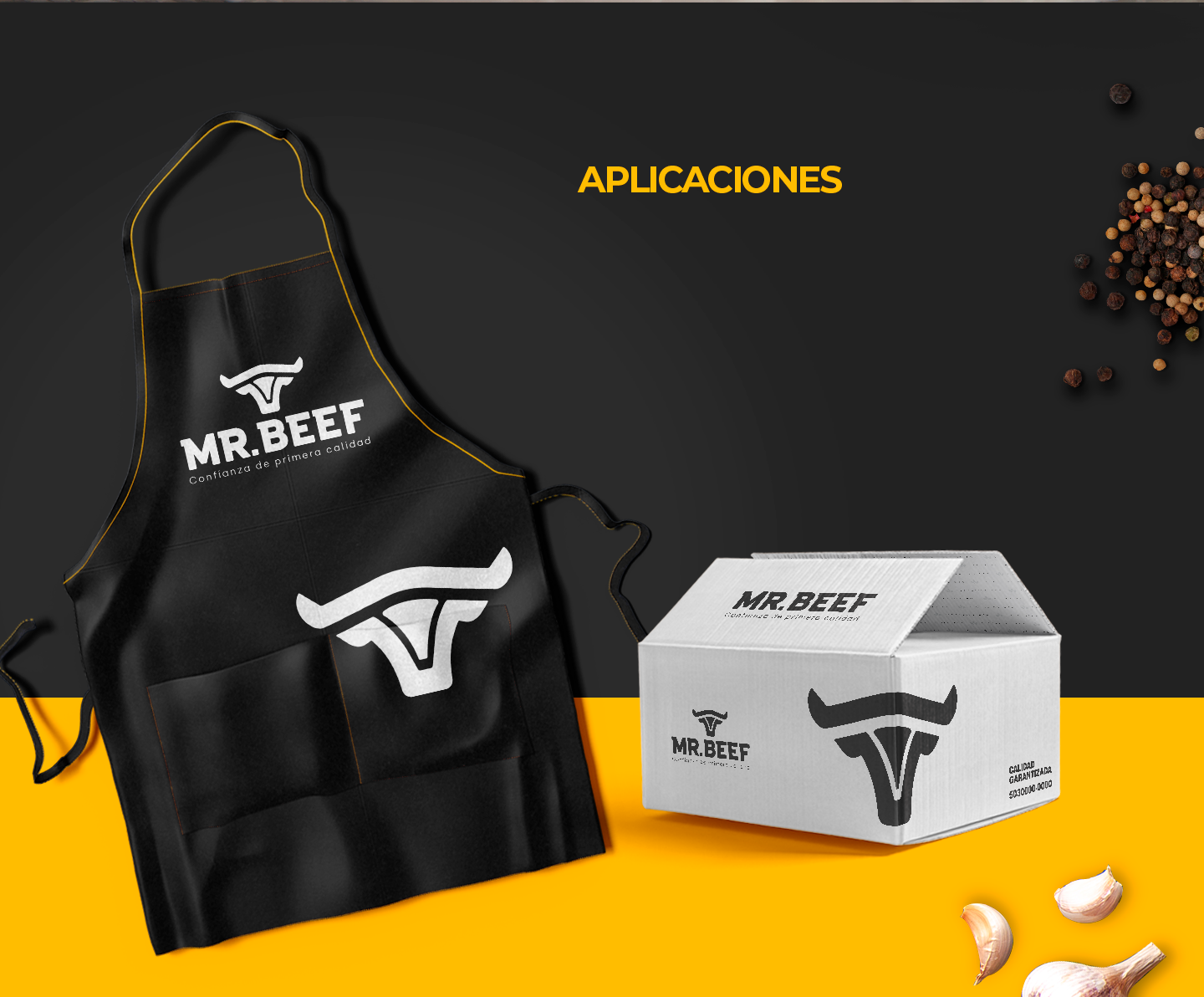
The brand was adapted to materials such as boxes for product deliveries, as well as aprons.
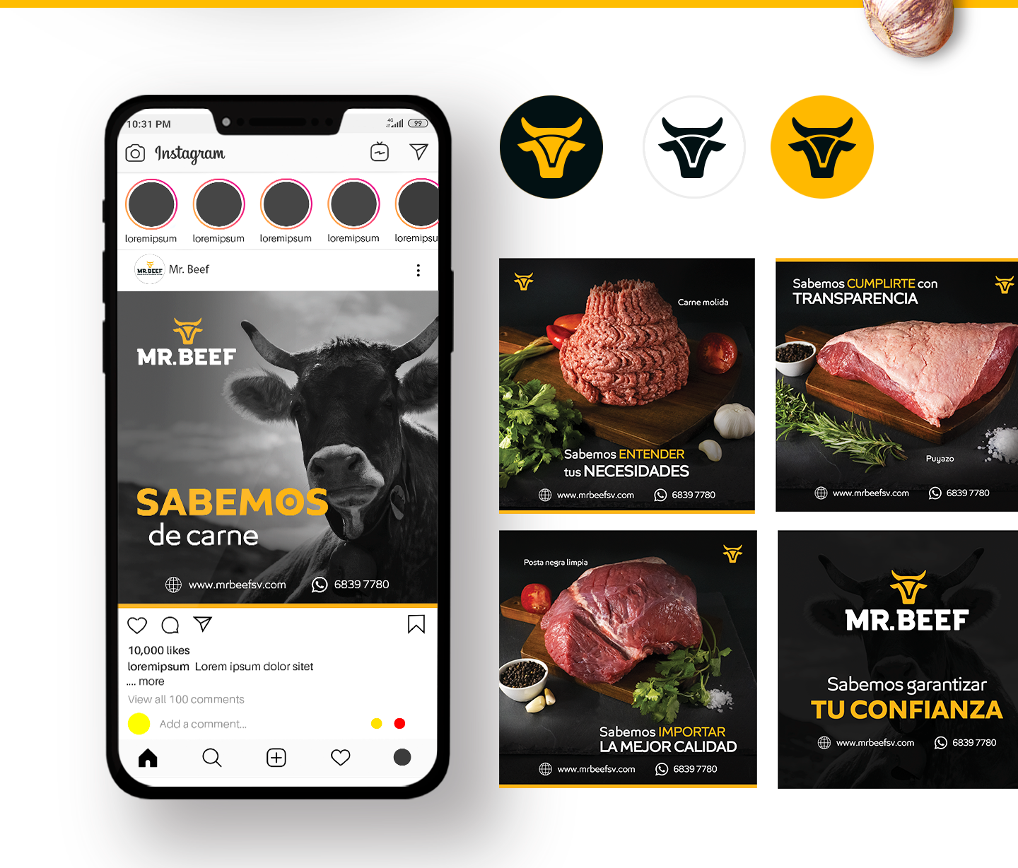
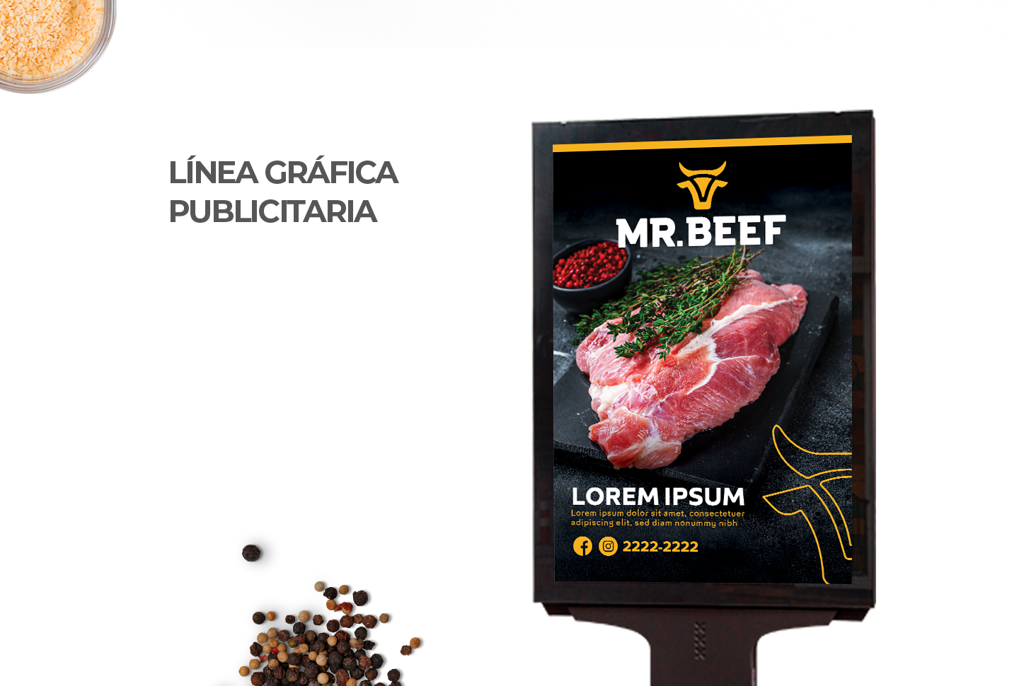
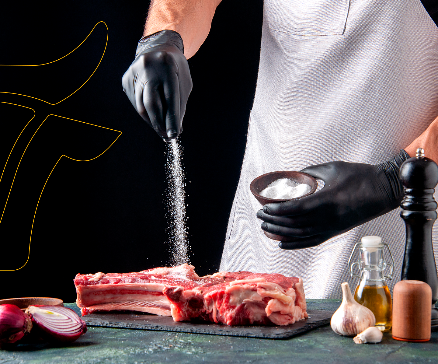
A launch campaign was developed, which was adapted to digital and public. With a modern, impressive design, which magnifies the product and transmits strength and solidity, the brand has been positioned as a reliable supplier. His concept of communication is: We know about meat.
