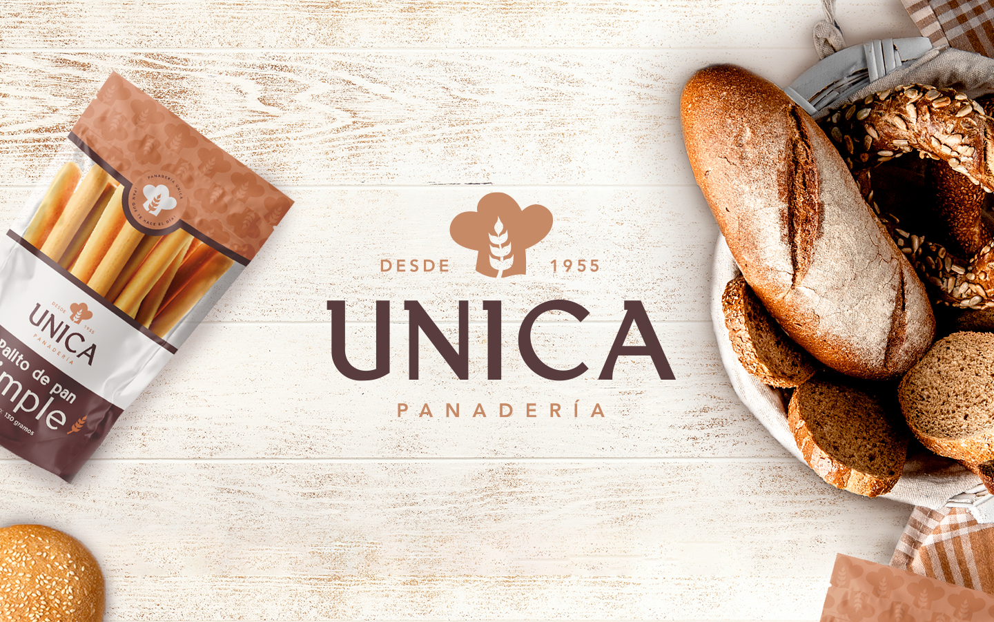
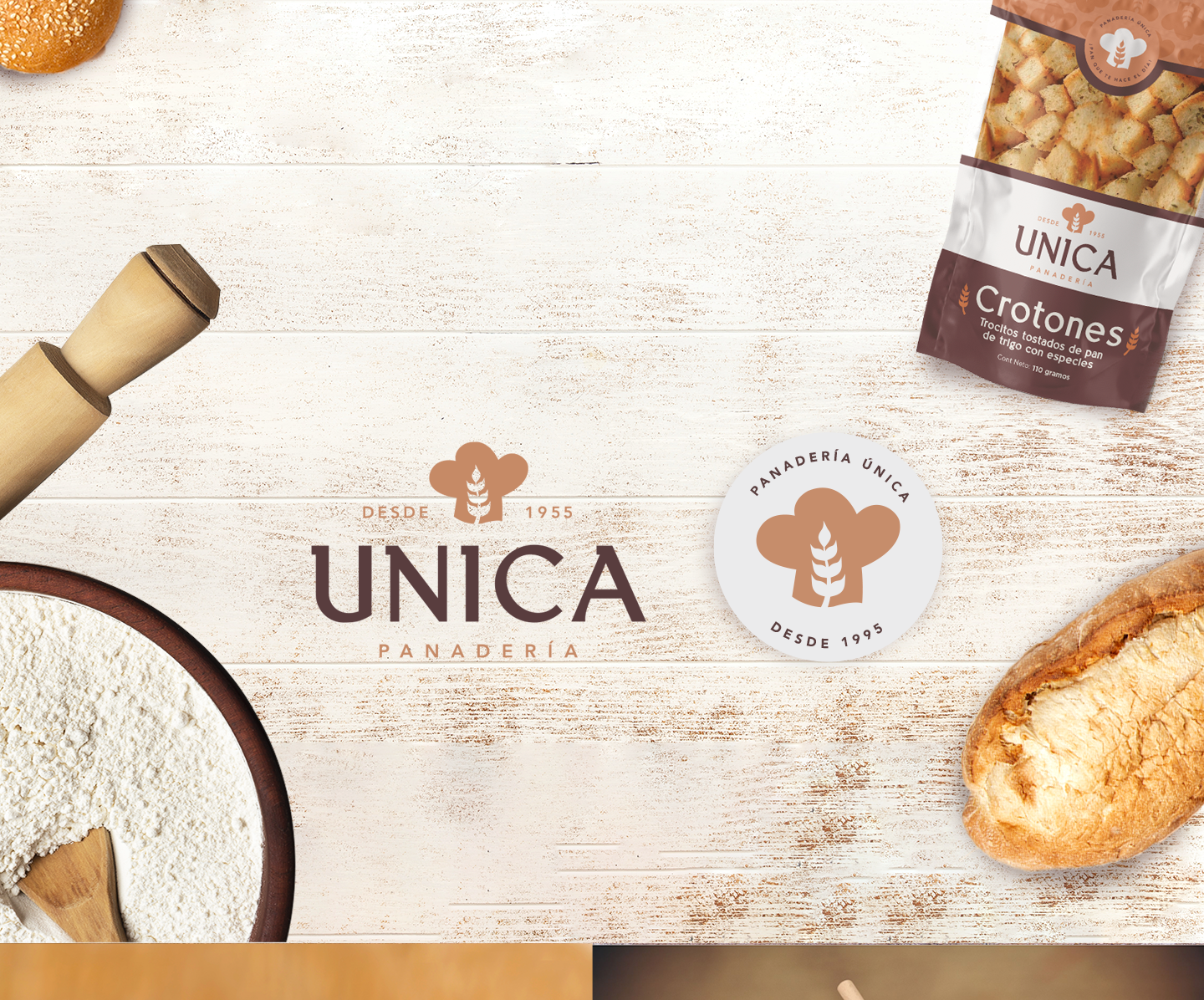
Panificadora La Única is a bakery with a long tradition in El Salvador, which needed to be renovated to project a more current image. In this project, Pepper became a Partner of Panificadora La Única to refresh the brand, modernizing and updating it, without losing the traditional values and essence that characterize it.
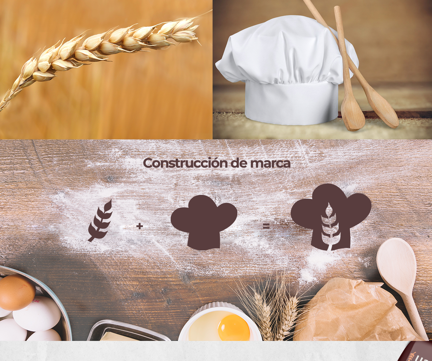
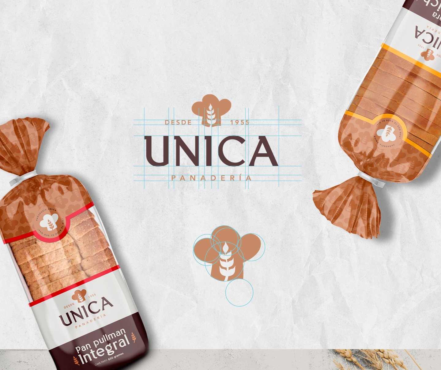
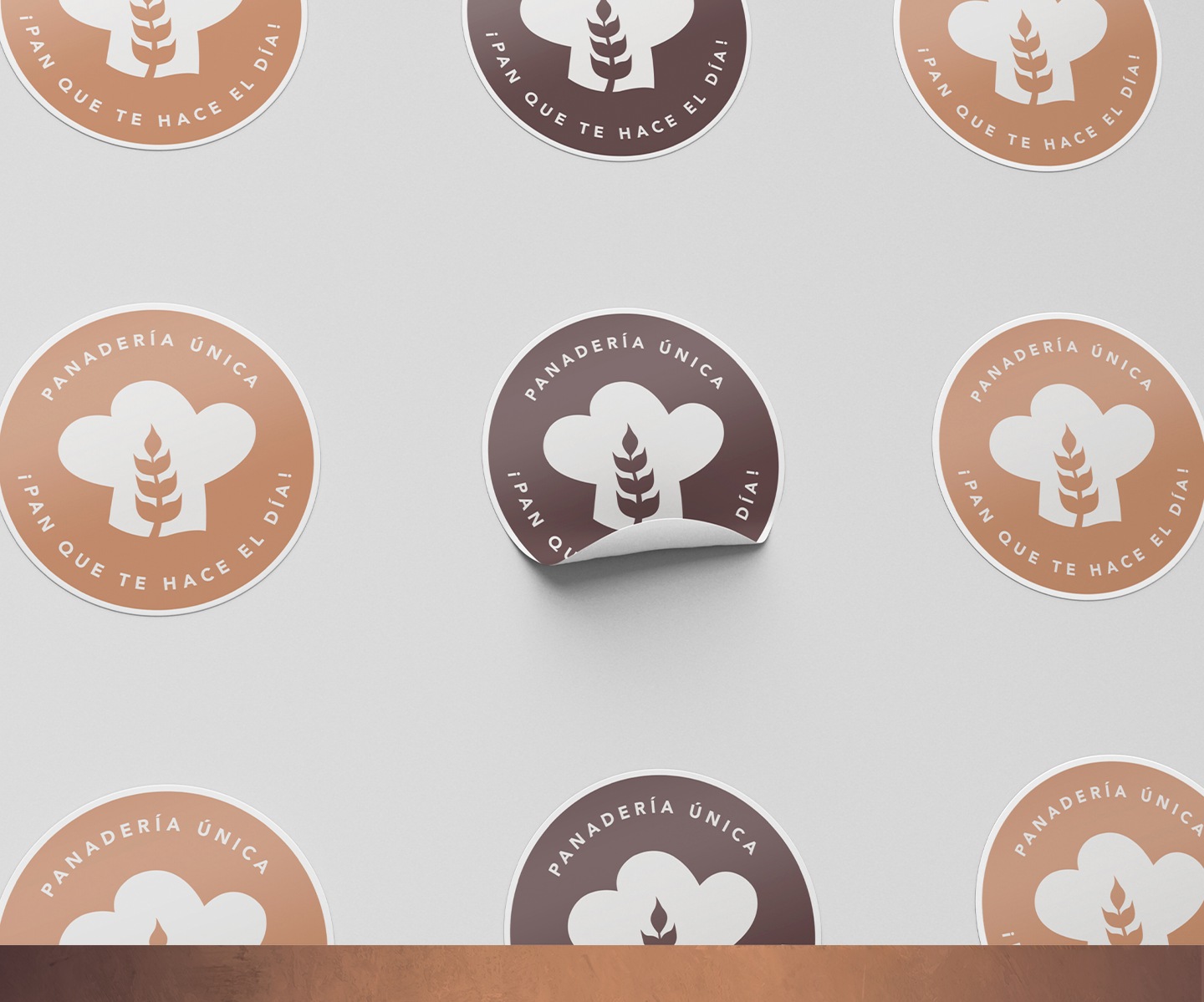
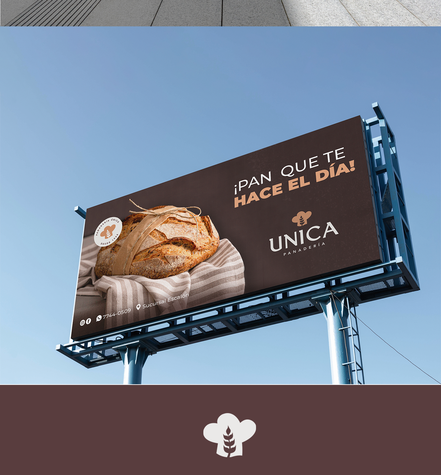
Its icon represents the combination between its main ingredient and the chef's hat that has been its hallmark over time. This logo is based on a Serif typeface that gives it modernity, strength and dynamism
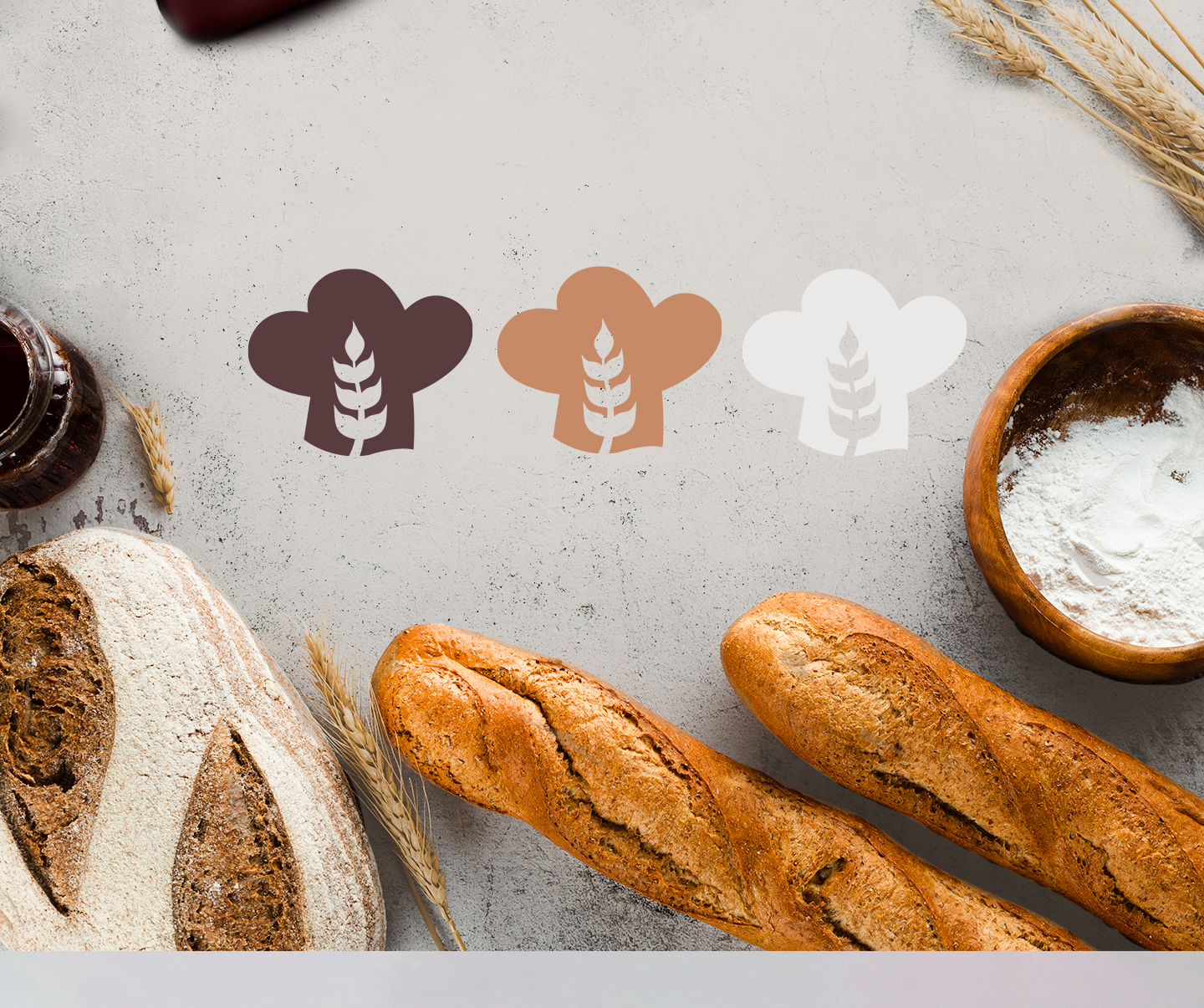
The color palette is based on the flavor and craftsmanship of its products. It is a perfect combination that reflects tranquility and security as well as tradition and flavor.
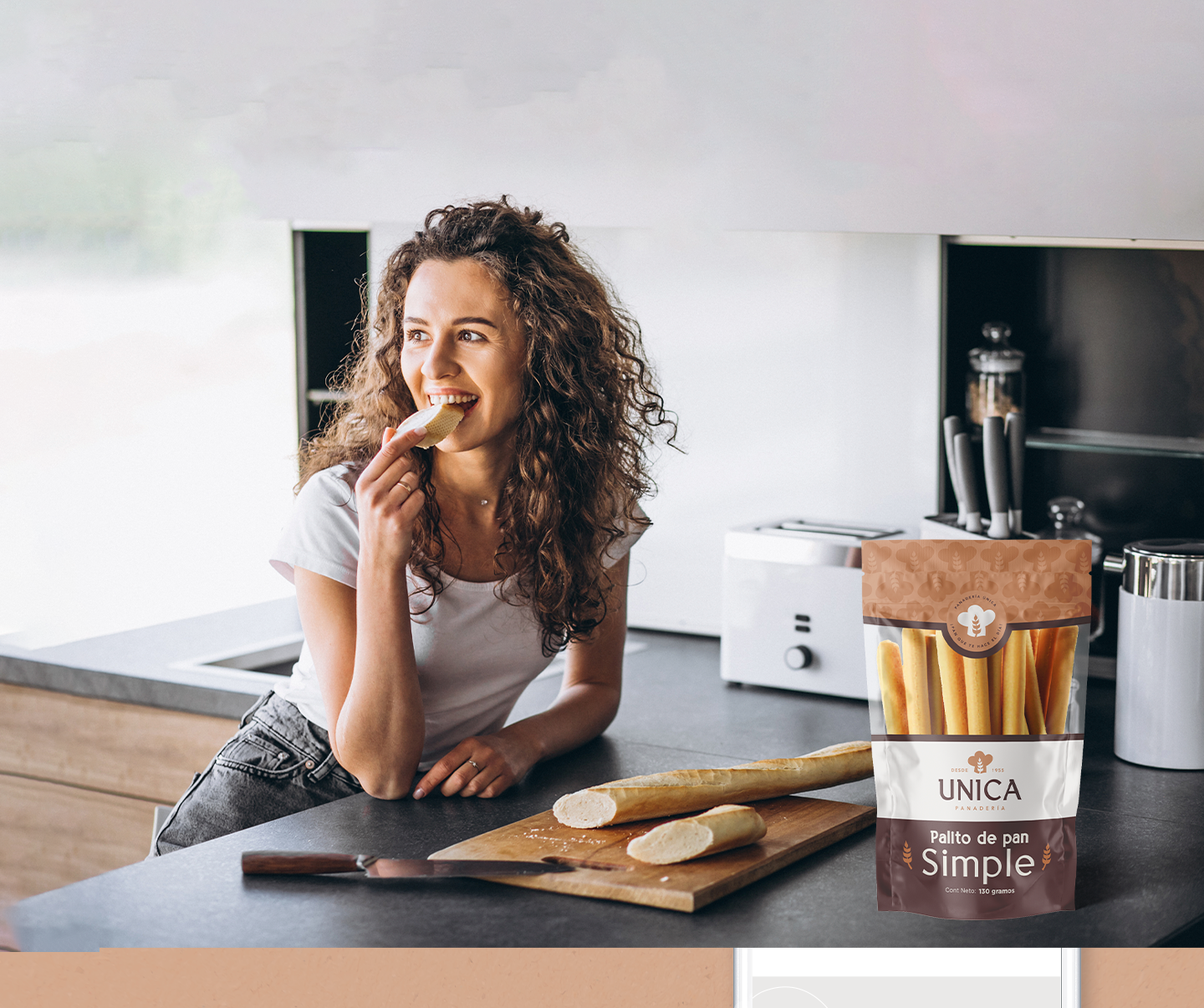
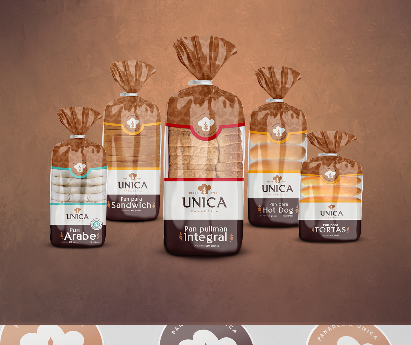
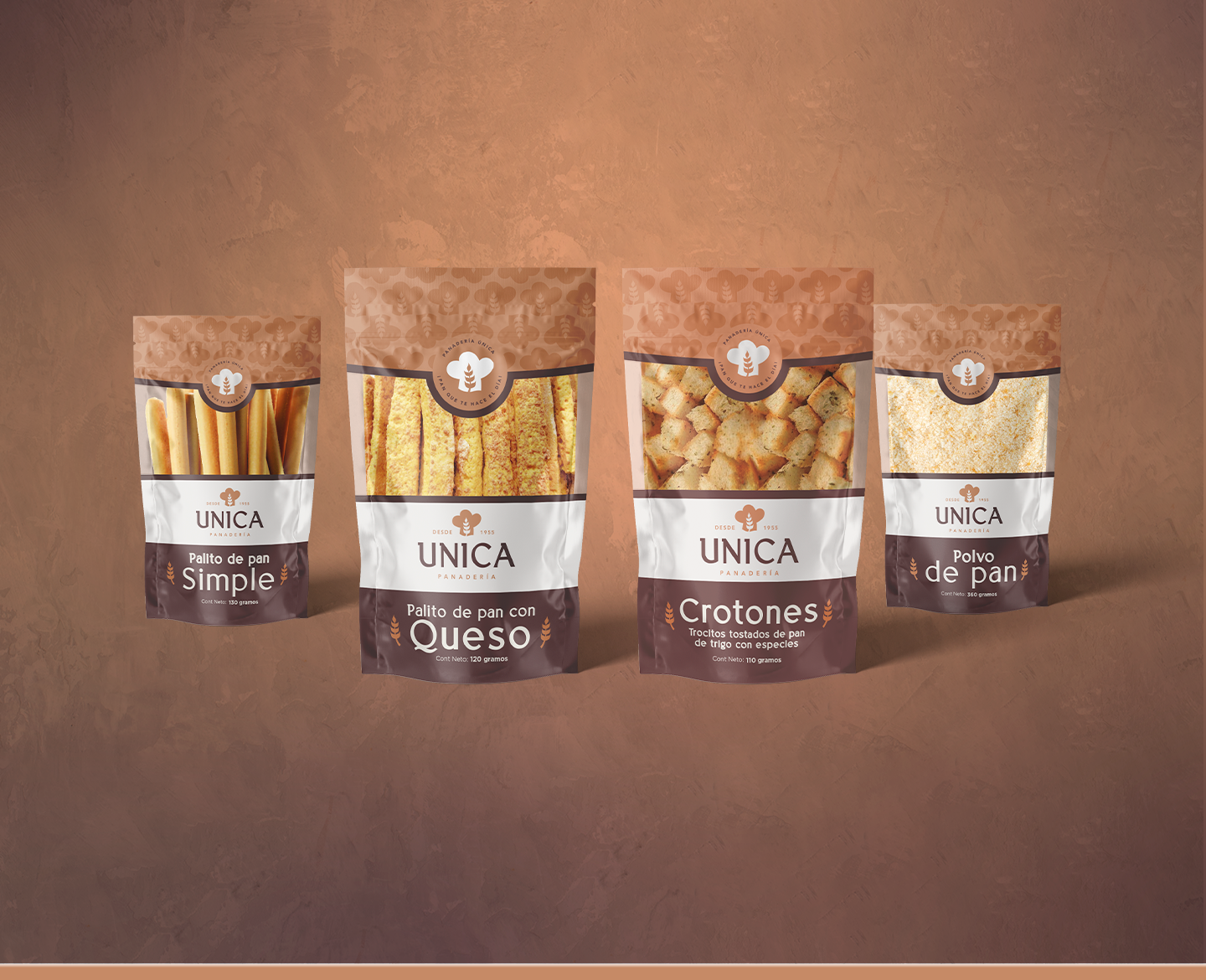
The entire packaging line was redesigned following a new graphic line, standardizing them to connect with the consumer at the point of sale.
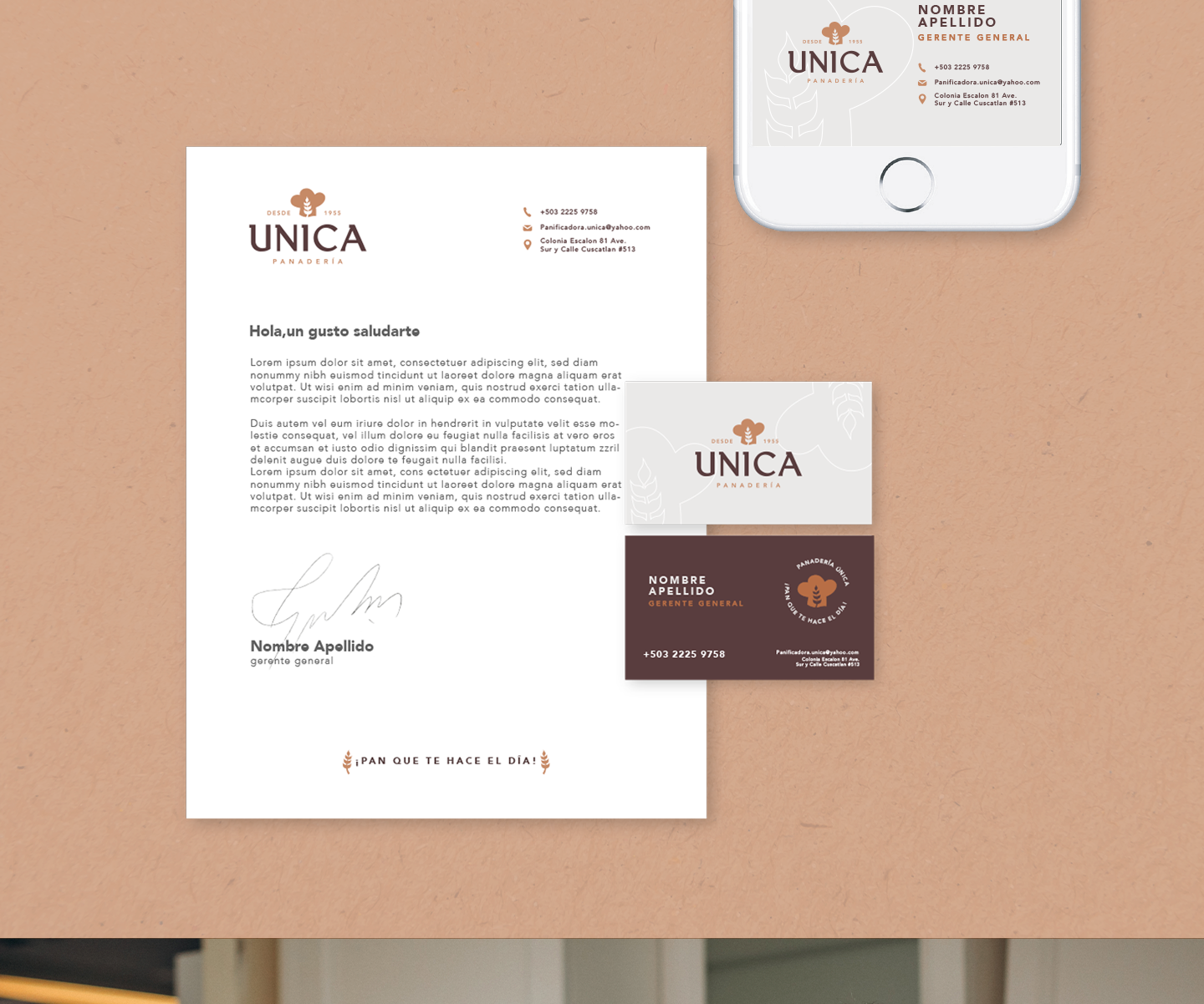
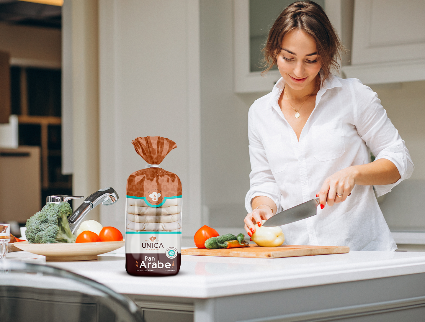
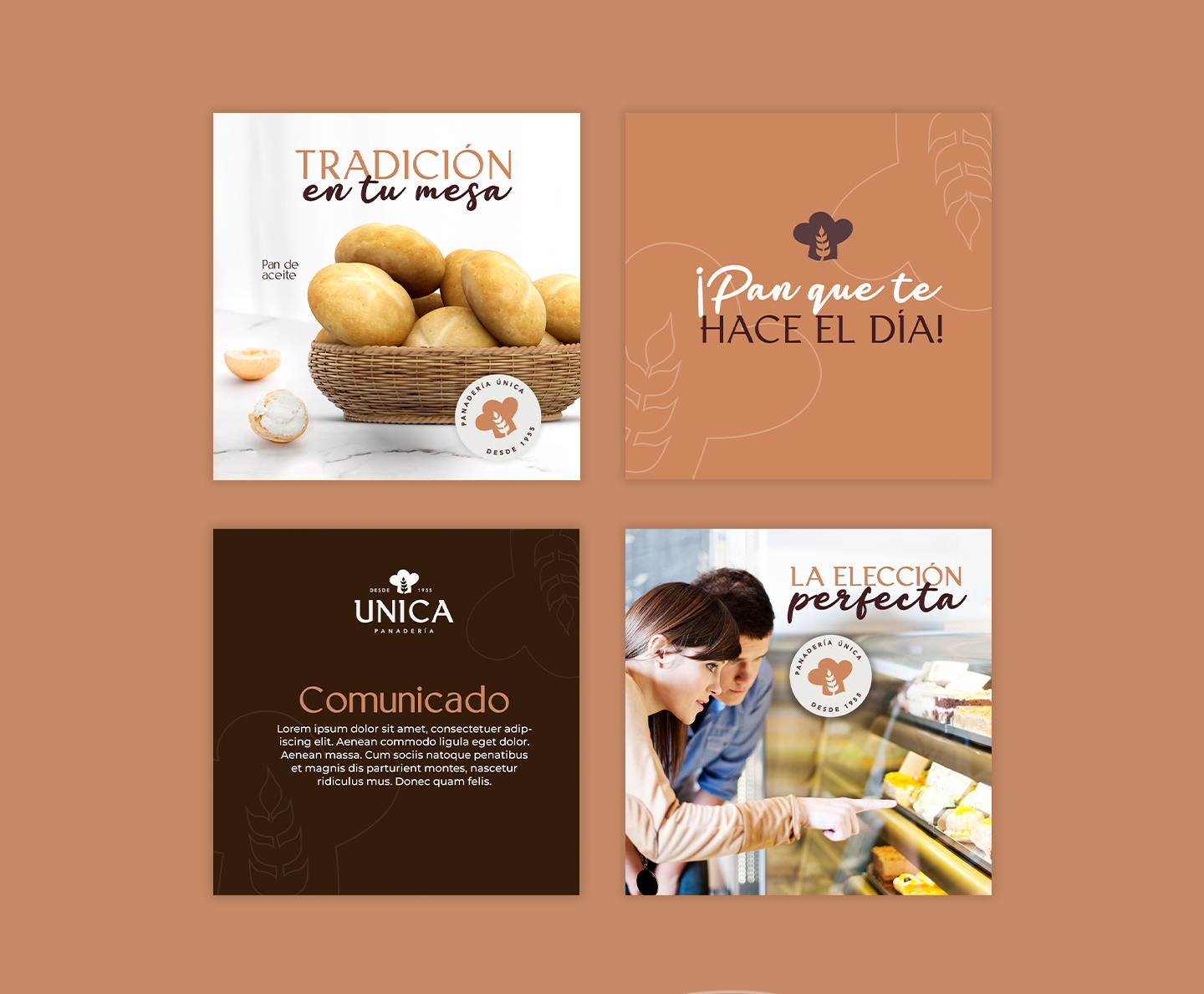
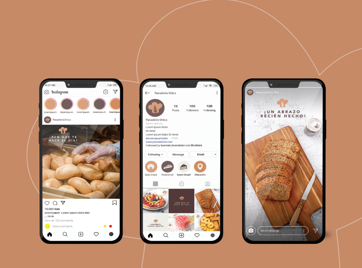
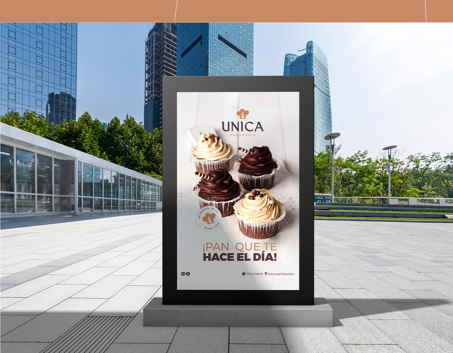
A digital graphic line manual was also developed to integrate communication and maintain a consistent identity in all adaptations of the brand. In the same way, the advertising graphic line was developed, maintaining a visual consistency.
