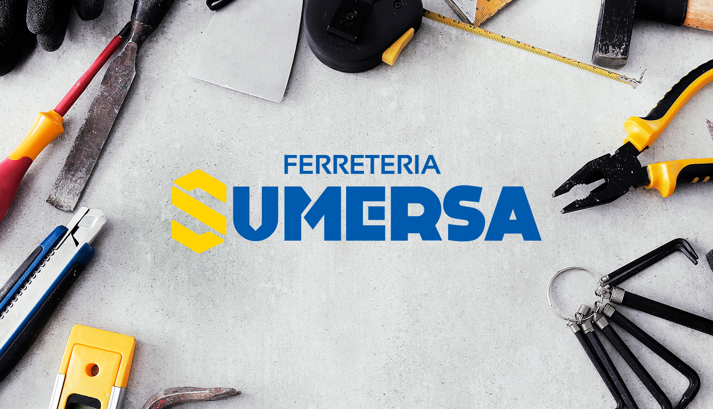
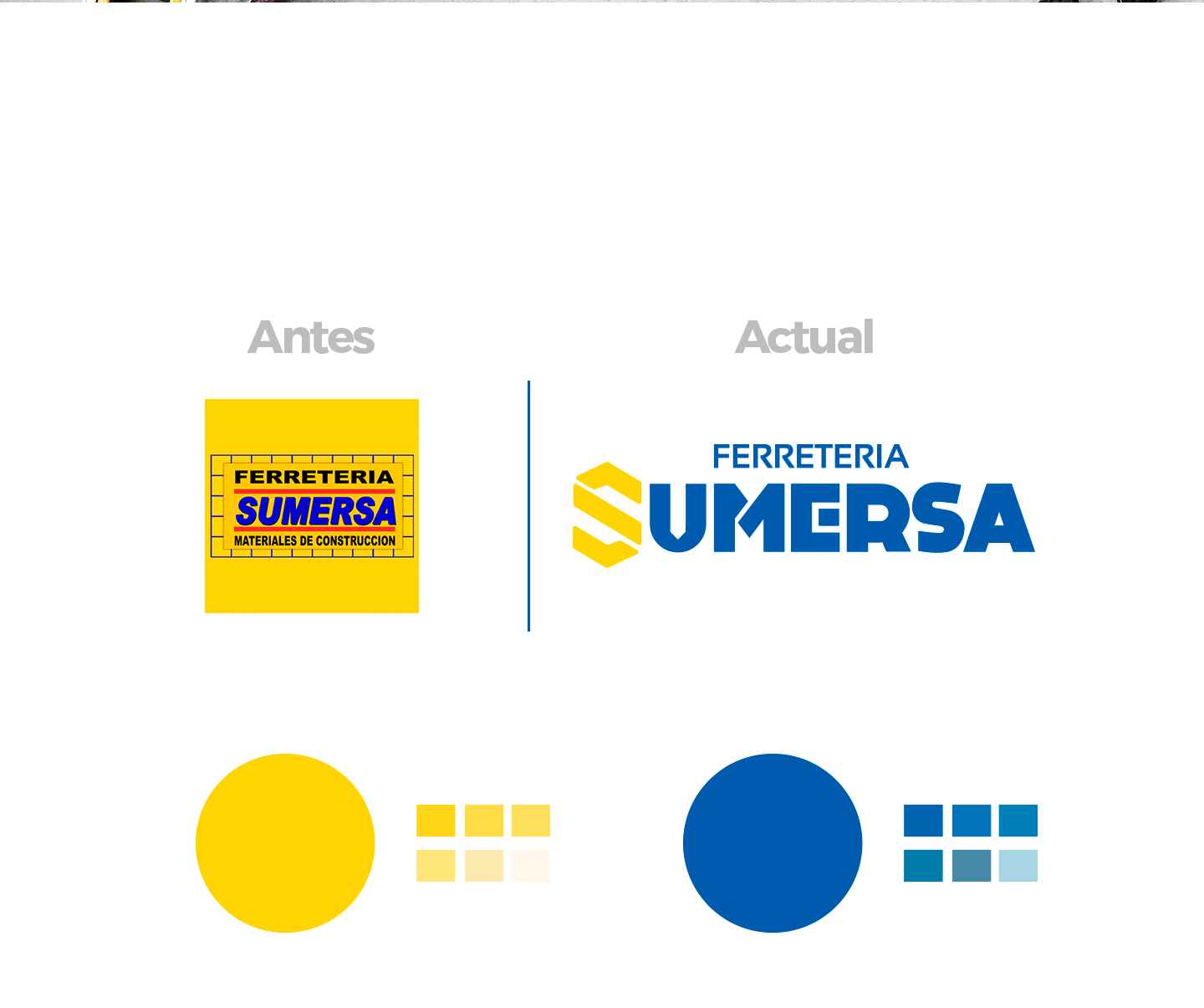
Based on an analysis, our Branding experts began to clean up the image to focus it more on new markets. Something completely modern but without losing the essence of themselves and that would allow them to be a positioning alternative within the best in the field of hardware stores.
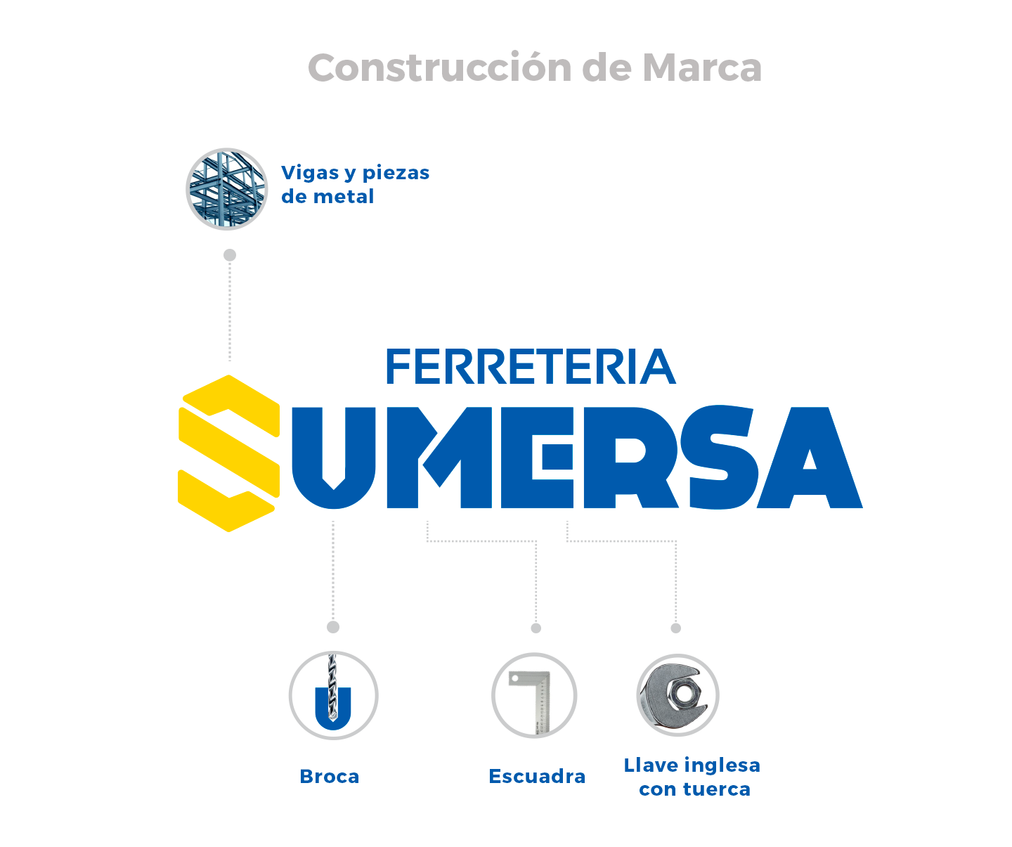
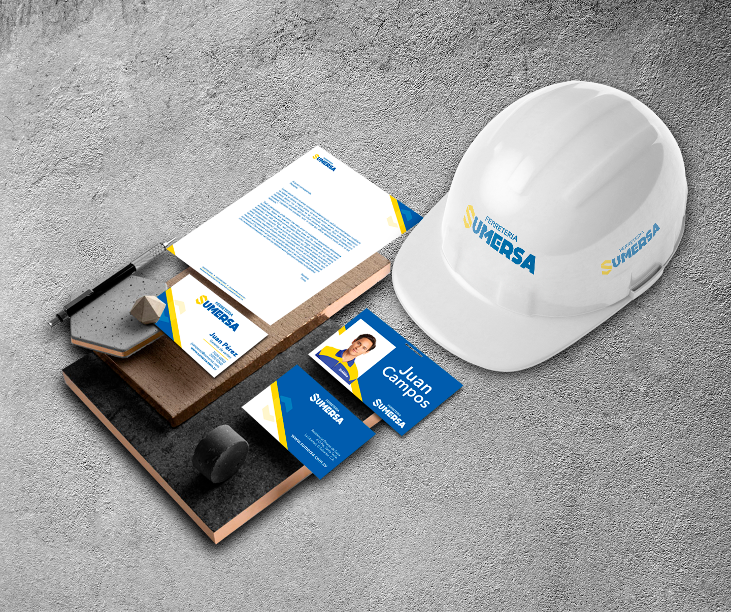
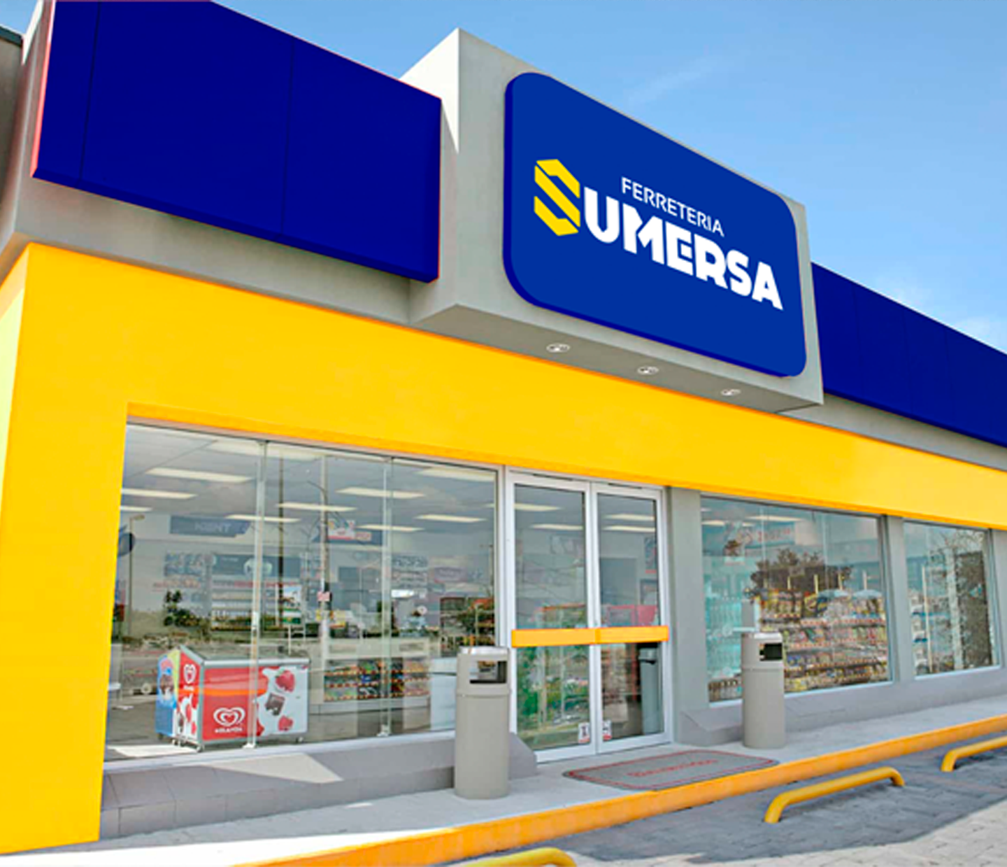
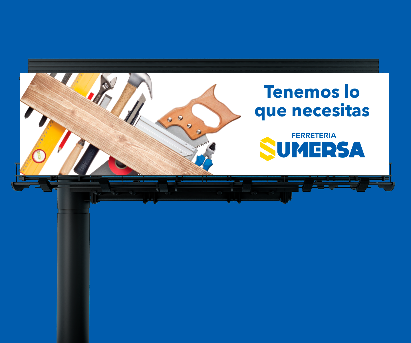
With the new line already modernized and the Branding created, it allowed SUMERSA hardware store to position itself as a renewed and competitive brand within the category. This is how the concept was able to evolve and transmit it through all proposed art.
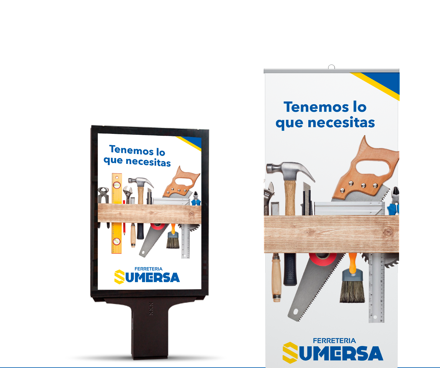
OOH Media
Within the graphic line, the color blue and yellow were used with a modern and up-to-date look that conveyed the world of the hardware store; Then we proceeded to make the stationery brand manual and advertising materials.
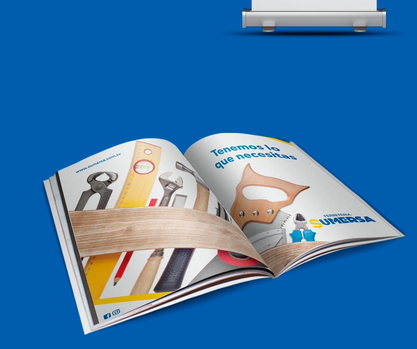
Magazine
For the magazine, we thought of a photographic style as shown, clean photographs where the product stands out, compositions that show experiences.

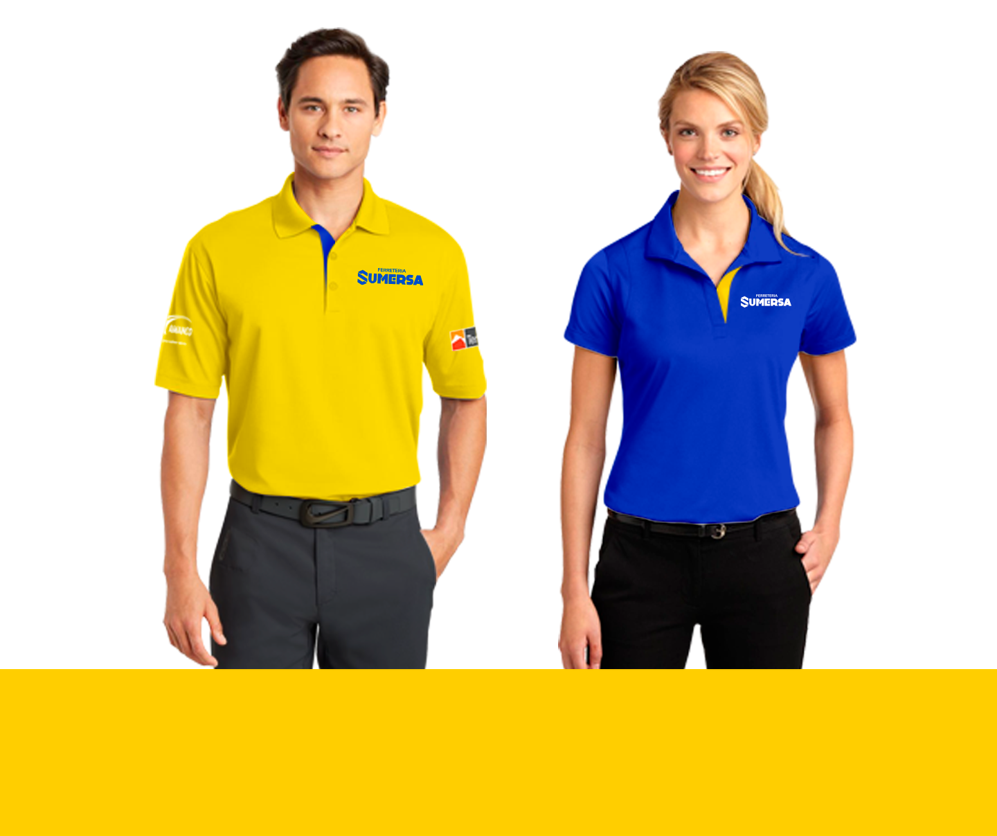
Uniforms
Uniforms were created for SUMERSA staff to highlight the personality, values and essence of the brand.
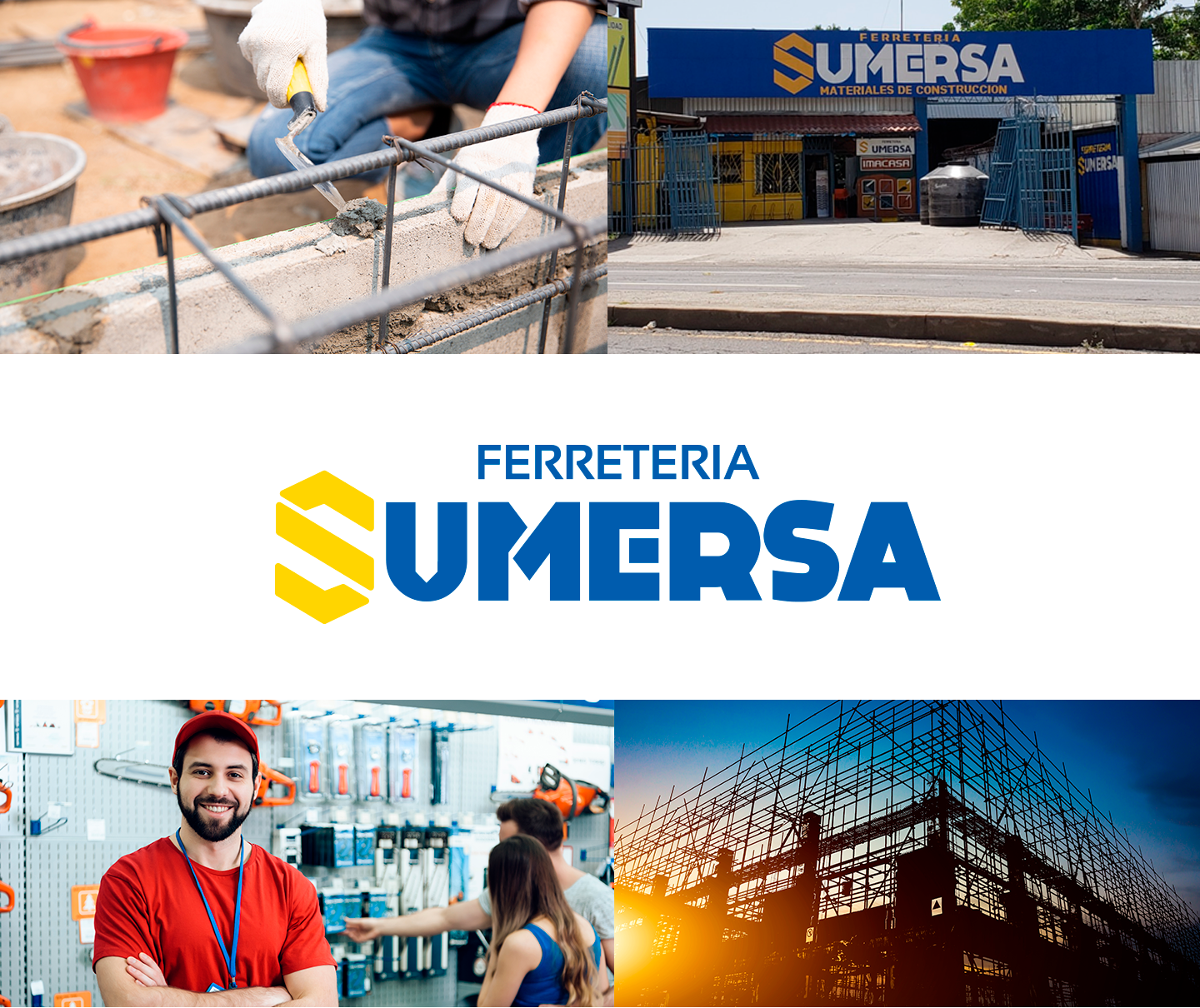

To all the people who strive to do a good job at SUMERSA, we have everything you need.
